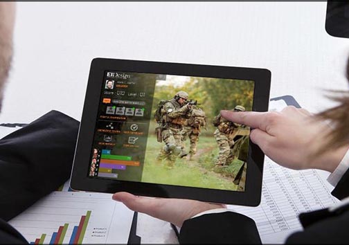
Mobile Learning, or learning on the go, provides multi-device support. This means that all Mobile Learning courses run seamlessly across devices ranging from smartphones or tablets to desktops or laptops. Additionally, they can move between devices during a given course with the flexibility to resume on another device exactly from where they left on a given device.
Gradually, there seems to be a shift from offering this multi-device support that features a fixed layout (Mobile friendly or Adaptive eLearning design) to a dynamic design (Mobile first or Responsive eLearning design) that automatically adapts to the viewable area of each device. Take a look at this video that showcases 7 examples of Responsive eLearning designs for higher engagement and better learning experience.
As you would have noted, our Responsive eLearning designs offer optimal viewing across devices, which creates a better learning experience. Learning interactions are also optimized for mobile devices, thereby creating higher engagement.
Want more? Book a free consultation with us to learn how you can use our Responsive or Mobile first eLearning designs to create better engagement and higher impact trainings!


