Why migration of your eLearning courses from Flash to HTML5 is necessary?
As Flash was the leading authoring tool till a few years ago, most organizations have a massive investment in Flash-based courses. Today, most browsers do not support Flash. Today’s learners want the flexibility to learn on the device of their choice (notably Tablets and Smartphones) and not just desktops and laptops. Since Flash does not support mobile devices, there is an intrinsic need to convert your Legacy Flash courses to HTML5, which would make them mobile compatible.
The need to migrate Legacy Flash courses to HTML5 can be viewed from two perspectives:
1. Organizational need
As we know, organizations have made significant investment on Flash-based courses in the past. Many of these have a long shelf life and continue to be relevant. However, these courses do not support mobile devices. There is very limited support for Flash in browsers. Very soon, this support may cease to exist.
Studies clearly indicate the learners’ shift from desktops to mobile devices. They also indicate designing eLearning courses that are responsive is emerging as a clear standard.
2. Learner need
Globally, there is a clear shift from traditional eLearning (available on desktops and laptops) to mLearning or mobile learning which is multi-device. Learners want this flexibility wherein they can learn on the device of their choice.
However, migration of eLearning courses to HTML5 is not as straightforward as it sounds. You can read some of my previous articles (listed in the Read More section at the end of this article) where I have highlighted these aspects and have also shared pointers to maximize your ROI in the process.
Now, we move on to an interesting opportunity this migration exercise provides. You can use this exercise to not only gain the technology uplift, but also incorporate the trending and more immersive learning strategies.
How can you leverage migration to HTML5 to enhance the impact of your eLearning courses?
Let me begin with the key factors that impact the ROI of training and then identify the techniques that can influence or impact this. We will then see how we can use this migration opportunity to embrace these techniques and create an impactful training.
Key factors that impact the ROI of training
- Learner’s reaction to the learning.
Is it interesting and relevant? - Learning effectiveness.
Is the learning sticky? Will the learning technique push the information from short-term memory to long-term? Is it enabling the learner in meeting the required learning outcome? - Application of learning.
Is the training facilitating knowledge application and is not just limited to knowledge acquisition? - Performance gain.
Is the training eventually leading to the required performance gain? - Business impact.
Is the performance gain creating the demonstrable gain that the business seeks?
How you can use the migration opportunity to create a positive impact on the ROI?
Here are my recommendations. You can leverage this opportunity to:
Use learning techniques that engage and motivate learners, including:
- Gamification.
- Microlearning (For both formal and informal learning).
- Scenario Based Learning.
- Storytorials (or Story-Based Learning).
Use innovative formats that appeal to learners (rather than traditional eLearning approaches), such as:
- Videos.
- Interactive Videos.
- Interactive Infographics.
Foster an environment of continuous, collaborative, and inclusive learning through:
- Learning Paths.
- Performance Support Tools.
- Learning Portals that feature Social Learning and participative learning (Curation).
Examples
Here are 4 examples that showcase how we enhanced the training impact as we migrated the Legacy Flash-based eLearning courses to HTML5 using more immersive techniques. All these examples feature:
- Creative instructional design.
- Modern look and feel.
- Focus on better visual hierarchy.
Imagine what you would have got if you had opted for only technology uplift. These superior designs uplift the learner engagement quotient and facilitate sticky learning.
Example 1 – Traditional eLearning course redesigned (and migrated to HTML5) to be more intuitive, interactive, and engaging
This course was originally a traditional eLearning course which needed to be redesigned for a modern learner profile.
- In the earlier design, users had to watch a long video and go through a welcome screen before they were introduced to the menu, which was not intuitive. To address this, we combined the Welcome screen and the Menu into one interactive screen.
- Besides, there were Overview, Objectives, and Coming Up Next screens, which further added to delay in the learning process. We eliminated this unnecessary delay by combining the Overview and Objectives screen into one interactive screen.
- We also revisited static screens and gave them proper visual hierarchy that allowed the users (especially non-audio users) to better focus on the key content.
- Non-intuitive interactivities, which involved clicking on images that appeared to be part of the background image, were revamped to contextual icon clicks, which probed the user to interact effectively.
Overall, the new, migrated course offered the learners a more intuitive experience through better hierarchy in information and engaging layouts, and users found it easier to navigate through the course. The new course design also offered the learners better ways to interact in the course, and they now had better control over the pace at which they wanted to learn.
Before: 3 separate frames on Introduction and Module structure
After: A single frame with required information (layered and more intuitive)
Before: Image was not relevant to the content and visual hierarchy was not also not apt
After: Relevant imagery and precise information hierarchy
Example 2 – Migration of Flash-based eLearning course with heavy visuals and animations into HTML5 format with Microlearning elements
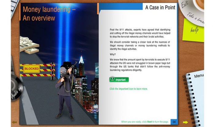
This course was originally a Flash-based, traditional eLearning course with heavy visuals supported with animations. The whole content was presented in a user interface that looked like a book. The content was presented using contextual imagery and typography.
- The challenge we faced when migrating it for a multi-device delivery using HTML5 was to follow the general guidelines of a responsive design yet keep the same degree of engagement with visuals and interactions.
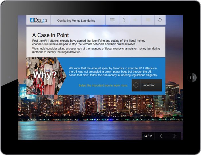
- The first thing we did was simplify the user interface, so it would work seamlessly on all devices and platforms. To keep the engagement factor intact, we retained the use of impactful imagery to convey key messages and added icons and buttons to show/highlight additional content.
- Also, considering the changes in user behavior attributed to usage of mobile devices for learning, we divided the content into smaller, bite-sized nuggets and worked towards making the interactions and layouts work seamlessly on all devices.
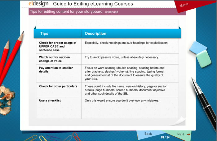
Before: The design looks dated (the initial course was designed over 7 years ago)
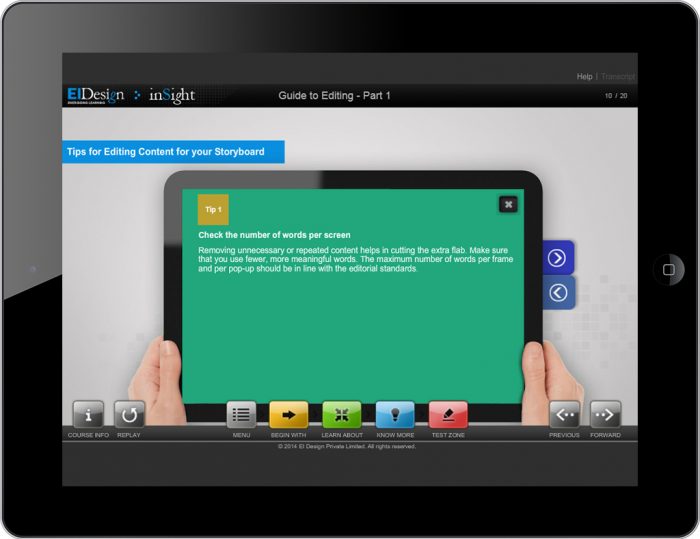
After: Modern and contextual imagery is used to set the context
Before: The design looks dated and screen looks cluttered
After: Contextual imagery and a clear visual hierarchy
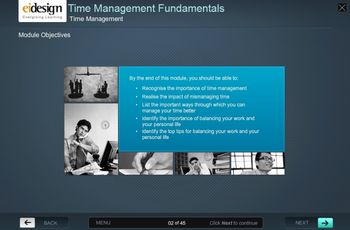
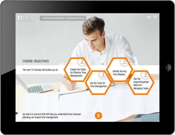
Example 3 – Migration of older HTML course on Time Management into Mobile-friendly Microlearning nuggets featuring Videos, Scenarios-based learning, and Gamification
The original course was initially developed using an older HTML framework that was not compatible with Smartphones and had a lot of interactivities that were not optimized for a mobile platform.
- We converted the whole course on Time Management into bite-sized, Microlearning nuggets that could be viewed on all devices and offered the learners the flexibility to learn at their own pace.
- The migrated course delivered the learning in various formats, including Videos, Scenarios, Gamified activities, etc., which, all put together, helped step up the learner engagement quotient and offer them an immersive learning experience.
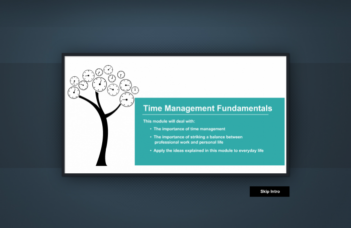
Before: Traditional eLearning design format
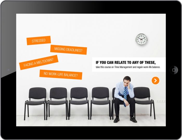
After: Uses a Scenario based learning in a Guided exploration mode
Before: Traditional and heavy design
After: Easy to read and clean uncluttered design
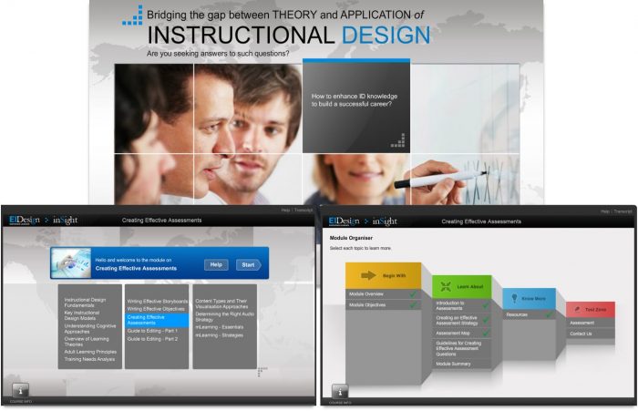
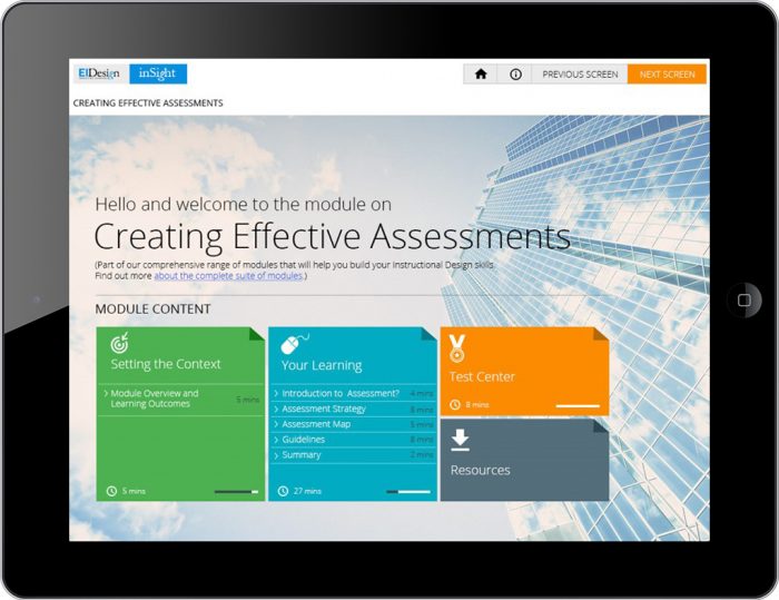
Example 4 – Migration of a traditional, page turner eLearning course into scenario-based, Mobile Apps to engage a modern learner demographic
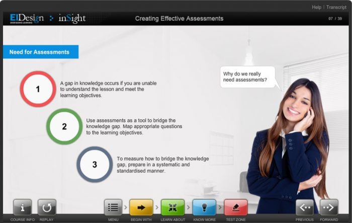
This was a traditional eLearning module created as a PPT and integrated into an articulate presenter framework with minimal controls for the user. It was more like a page turner wrapped into a nice User Interface.
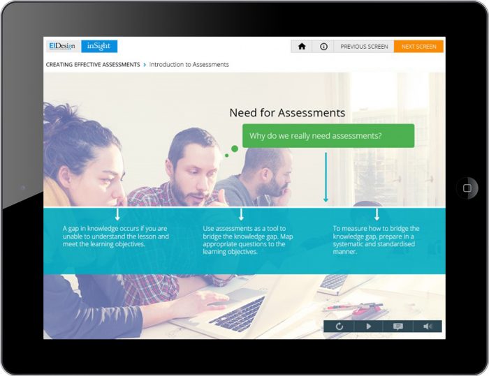
- But given the modern audience profile who would take the course on Instructional Design skills, we migrated the course into a scenario-driven approach that would enable the learner to learn, practice, and apply their skills in the subject through interesting exercises and assessments.
- The course was also made compatible with Tablets to offer the users the flexibility to take the course from anywhere, on the move.
- Later, we converted the courses into Mobile Apps, so learners could have offline access to the courses, which helped them practice their learnings at the precise time of need.
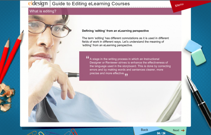
Before: Cluttered design
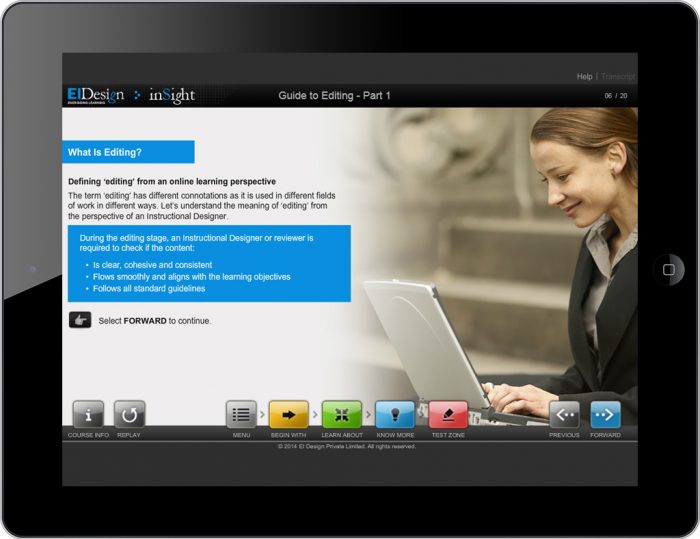
After: Uncluttered and crisp design with clear visual hierarchy
Before: Traditional format
After: Modern design
I hope this article gives you food for thought that you can use as you plan the migration of traditional eLearning courses to HTML5 format. Do use this opportunity to enhance your training delivery’s impact. If you have any queries, do contact me.
Read More
