From being a desirable approach, mobile learning is fast becoming a standard for online training. Now, you hear of debate on mobile friendly vs. mobile first designs. In this article, I share a case study featuring a mobile first design in eLearning.
A Case Study On Mobile First Designs In eLearning
Mobile learning has matured over the last 8 years and has seen a steady increase in its adoption by L&D teams worldwide. With its intrinsic strengths of any time, anywhere access to learners, it comes as no surprise that it is now seen as the future of learning.
Specifically:
- It provides control to the learners with the added advantage of flexibility as they can choose when to learn, how to learn, and which device to learn on.
- It facilitates higher usage and application as it is accessible to all learners within their workflow. They can access the required inputs at the moment of their need.
- From the organizational perspective, it can address the wide spectrum of corporate training needs making it the first choice of L&D teams.
What Are the Key Drivers That Are Increasing Its Adoption?
Besides the flexibility and control mobile learning offers to learners, the following factors are accelerating its adoption:
- Look at the extensive usage of smartphones in our daily lives. Given this, using smartphones for training (to facilitate both formal and informal learning) makes sense.
- More often than not, learners do not log in to the LMS or intranet to seek inputs they need during work. However, if these inputs (formal training/learning summaries/job-aids and so on) are available on smartphones, they will certainly be accessed and processed. This reality check is leading organizations to offer more pieces of training in the mobile learning format.
- For training to be engaging, we need to offer it in formats that engage learners better. Notably, mobile learning uses microlearning techniques that make learning short and easy to internalize. Furthermore, it normally features formats like videos, interactive videos, and apps for learning that resonate better with learners.
- Another significant factor is that mobile learning solutions offer multi-device support. This flexibility allows the same course to be available on desktops/laptops and tablets/smartphones. Learners can begin learning on office desktops but continue the practice or quizzes on their smartphones.
All these factors are accelerating the adoption of mobile learning for corporate training.
Now, let me address mobile friendly versus mobile first designs in eLearning—What do they mean and when should you use these approaches?
To understand this better, let us look at the evolution of mobile learning. Then, I will share a case study that features a mobile first design in eLearning.
How Has Mobile Learning Evolved, And What Considerations Are Important As You Use It Today (Mobile Friendly Vs. Mobile First Design In eLearning)?
At EI, our mobile learning practice was established in 2011. In the absence of established authoring tools then, we had created a custom HTML5 framework. During the last 8 years, we have been part of the evolution and maturing of mobile learning solutions.
Let me summarize the evolution of mobile learning. This backdrop is necessary to understand as it leads us to the mobile first aspect:
- The early mobile learning solutions supported formal training, which was rendered in the traditional eLearning format. During this phase, only certain components of the formal training were made available on mobile devices.
- The second avatar was the use of mobile learning to offer informal learning, notably as job aids (Performance Support Tools or PSTs).
- Increased usage of microlearning-based techniques enabled mobile learning solutions to address formal training (with learning paths) and informal training with equal ease. This truly accelerated the adoption of mobile learning to address most of the corporate training needs today.
With the maturing of authoring tools and supporting technologies to create mobile learning solutions, mobile learning solutions are now available in 2 formats:
- Mobile Friendly (Adaptive designs)
- Mobile First (Fully responsive designs)
How Can You Determine If You Should Opt For The Mobile Friendly Or The Mobile First Design In eLearning?
At EI, we make the distinction based on how content is consumed by learners (that is, on which device).
Mobile Friendly (Adaptive Designs)
These are multi-device designs and work seamlessly across desktops/laptops and tablets/smartphones.
- The notable aspect is that on smartphones, they map the landscape mode well but will shrink when viewed in portrait mode.
- This approach is designed when content is mainly to be consumed on a combination of desktops/laptops and tablets and partially on smartphones.
- In short, these designs are not optimized for smartphones.
Mobile First (Fully Responsive Designs)
While this approach also supports a multi-device approach, the designs here are fully optimized for smartphones.
- The design adapts to the viewable area and as a result, the user gets the same experience in both portrait mode as well as landscape mode of the mobile device.
- This approach should be adopted when you expect a majority of content consumption on smartphones.
Case Study
Now, I share a case study that features a mobile first (fully responsive design) approach. The learning strategy is Scenario-Based Learning (SBL).
Key Aspects Of Mobile First Designs For eLearning
As mentioned earlier, this approach was used as we expected nearly 100% of the usage of smartphones.
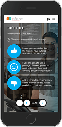
As a result, we had to design learning experiences that were optimized for smartphones. The cues were taken from the way we interact with smartphones as well as from Apps.
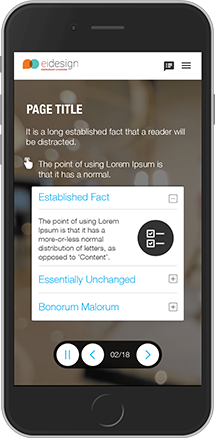
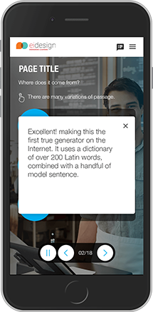
- The interactive screen had simple and intuitive interactivities (similar to a mobile app design approach).
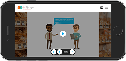
- To bring in more dynamic animations and visual effects, the scenario screens were converted to video nuggets.
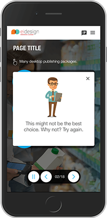
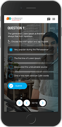
- Knowledge checks were converted to decision-making activities. Usage of icons to represent key concepts made the processing of content easier for the learners.
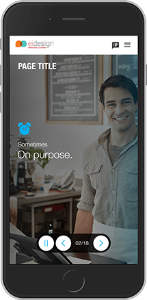
- We simplified the conversational screens’ representations by keeping minimal content on the screen and using intuitive mobile first interactivities.
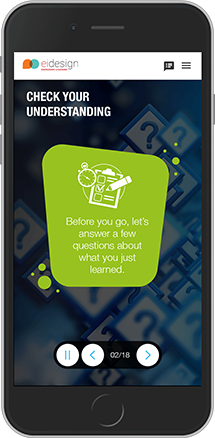
- We also used knowledge checks periodically to check the learner’s understanding by using interesting and contextual visuals.
Impact
With this approach, we were able to create a high impact mobile first design in eLearning. The designs are visually engaging and interactions are optimized for mobile devices as the users wanted.
Listen to the audio version of the article:
I hope this article helps you in understanding the differences between a mobile friendly versus mobile first approach and aids you in opting the right approach for your mobile learning solutions. If you have any queries, do contact me at apandey@eidesign.net.
Read More:
- How Can You Use Custom Mobile Learning Solutions To Enhance The Impact Of Your Corporate Training
- 5 Examples of How To Use Mobile Learning In Retail To Maximize Your Training Impact
- 10 Killer Examples Of Mobile Learning To Boost Employee Engagement And Performance
- How To Use Mobile Learning To Increase Employee Engagement And Boost Performance
- 5 Questions Answered – Why you Should Opt For Mobile Learning For Corporate Training
